- You are here:
-
Home

-
Contents
-
Part IV. Tools and Approaches
-
Ergonomics
- Work Systems Design

Work Systems Design
Workstations
An Integrated Approach in the Design of Workstations
In ergonomics, the design of workstations is a critical task. There is general agreement that in any work setting, whether blue-collar or white-collar, a well-designed workstation furthers not only the health and well-being of the workers, but also productivity and the quality of the products. Conversely, the poorly designed workstation is likely to cause or contribute to the development of health complaints or chronic occupational diseases, as well as to problems with keeping product quality and productivity at a prescribed level.
To every ergonomist, the above statement may seem trivial. It is also recognized by every ergonomist that working life worldwide is full of not only ergonomic shortcomings, but blatant violations of basic ergonomic principles. It is clearly evident that there is a widespread unawareness with respect to the importance of workstation design among those responsible: production engineers, supervisors and managers.
It is noteworthy that there is an international trend with respect to industrial work which would seem to underline the importance of ergonomic factors: the increasing demand for improved product quality, flexibility and product delivery precision. These demands are not compatible with a conservative view regarding the design of work and workplaces.
Although in the present context it is the physical factors of workplace design that are of chief concern, it should be borne in mind that the physical design of the workstation cannot in practice be separated from the organization of work. This principle will be made evident in the design process described in what follows. The quality of the end result of the process relies on three supports: ergonomic knowledge, integration with productivity and quality demands, and participation. The process of implementation of a new workstation must cater to this integration, and it is the main focus of this article.
Design considerations
Workstations are meant for work. It must be recognized that the point of departure in the workstation design process is that a certain production goal has to be achieved. The designer—often a production engineer or other person at middle-management level—develops internally a vision of the workplace, and starts to implement that vision through his or her planning media. The process is iterative: from a crude first attempt, the solutions become gradually more and more refined. It is essential that ergonomic aspects be taken into account in each iteration as the work progresses.
It should be noted that ergonomic design of workstations is closely related to ergonomic assessment of workstations. In fact, the structure to be followed here applies equally to the cases where the workstation already exists or when it is in a planning stage.
In the design process, there is a need for a structure which ensures that all relevant aspects be considered. The traditional way to handle this is to use checklists containing a series of those variables which should be taken into account. However, general purpose checklists tend to be voluminous and difficult to use, since in a particular design situation only a fraction of the checklist may be relevant. Furthermore, in a practical design situation, some variables stand out as being more important than others. A methodology to consider these factors jointly in a design situation is required. Such a methodology will be proposed in this article.
Recommendations for workstation design must be based on a relevant set of demands. It should be noted that it is in general not enough to take into account threshold limit values for individual variables. A recognized combined goal of productivity and conservation of health makes it necessary to be more ambitious than in a traditional design situation. In particular, the question of musculoskeletal complaints is a major aspect in many industrial situations, although this category of problems is by no means limited to the industrial environment.
A Workstation Design Process
Steps in the process
In the workstation design and implementation process, there is always an initial need to inform users and to organize the project so as to allow for full user participation and in order to increase the chance of full employee acceptance of the final result. A treatment of this goal is not within the scope of the present treatise, which concentrates on the problem of arriving at an optimal solution for the physical design of the workstation, but the design process nonetheless allows the integration of such a goal. In this process, the following steps should always be considered:
- collection of user-specified demands
- prioritizing of demands
- transfer of demands into (a) technical specifications and (b) specifications in user terms
- iterative development of the workstation’s physical layout
- physical implementation
- trial period of production
- full production
- evaluation and identification of rest problems.
The focus here is on steps one through five. Many times, only a subset of all these steps is actually included in the design of workstations. There may be various reasons for this. If the workstation is a standard design, such as in some VDU working situations, some steps may duly be excluded. However, in most cases the exclusion of some of the steps listed would lead to a workstation of lower quality than what can be considered acceptable. This can be the case when economic or time constraints are too severe, or when there is sheer neglect due to lack of knowledge or insight at management level.
Collection of user-specified demands
It is essential to identify the user of the workplace as any member of the production organization who may be able to contribute qualified views on its design. Users may include, for instance, the workers, the supervisors, the production planners and production engineers, as well as the safety steward. Experience shows clearly that these actors all have their unique knowledge which should be made use of in the process.
The collection of the user-specified demands should meet a number of criteria:
- Openness. There should be no filter applied in the initial stage of the process. All points of view should be noted without voiced criticism.
- Non-discrimination. Viewpoints from every category should be treated equally at this stage of the process. Special consideration should be given to the fact that some persons may be more outspoken than others, and that there is a risk that they may silence some of the other actors.
- Development through dialogue. There should be an opportunity to adjust and develop the demands through a dialogue between participants of different backgrounds. Prioritizing should be addressed as part of the process.
- Versatility. The process of collection of user-specified demands should be reasonably economical and not require the involvement of specialist consultants or extensive time demands on the part of the participants.
The above set of criteria may be met by using a methodology based on quality function deployment (QFD) according to Sullivan (1986). Here, the user demands may be collected in a session where a mixed group of actors (not more than eight to ten people) is present. All participants are given a pad of removable self-sticking notes. They are asked to write down all workplace demands which they find relevant, each one on a separate slip of paper. Aspects relating to work environment and safety, productivity and quality should be covered. This activity may continue for as long as found necessary, typically ten to fifteen minutes. After this session, one after the other of the participants is asked to read out his or her demands and to stick the notes on a board in the room where everyone in the group can see them. The demands are grouped into natural categories such as lighting, lifting aids, production equipment, reaching requirements and flexibility demands. After the completion of the round, the group is given the opportunity to discuss and to comment on the set of demands, one category at a time, with respect to relevance and priority.
The set of user-specified demands collected in a process such as the one described in the above forms one of the bases for the development of the demand specification. Additional information in the process may be produced by other categories of actors, for example, product designers, quality engineers, or economists; however, it is vital to realize the potential contribution that the users can make in this context.
Prioritizing and demand specification
With respect to the specification process, it is essential that the different types of demands be given consideration according to their respective importance; otherwise, all aspects that have been taken into account will have to be considered in parallel, which may tend to make the design situation complex and difficult to handle. This is why checklists, which need to be elaborate if they are to serve the purpose, tend to be difficult to manage in a particular design situation.
It may be difficult to devise a priority scheme which serves all types of workstations equally well. However, on the assumption that manual handling of materials, tools or products is an essential aspect of the work to be carried out in the workstation, there is a high probability that aspects associated with musculoskeletal load will be at the top of the priority list. The validity of this assumption may be checked in the user demand collection stage of the process. Relevant user demands may be, for instance, associated with muscular strain and fatigue, reaching, seeing, or ease of manipulation.
It is essential to realize that it may not be possible to transform all user-specified demands into technical demand specifications. Although such demands may relate to more subtle aspects such as comfort, they may nevertheless be of high relevance and should be considered in the process.
Musculoskeletal load variables
In line with the above reasoning, we shall here apply the view that there is a set of basic ergonomic variables relating to musculoskeletal load which need to be taken into account as a priority in the design process, in order to eliminate the risk of work-related musculosketal disorders (WRMDs). This type of disorder is a pain syndrome, localized in the musculoskeletal system, which develops over long periods of time as a result of repeated stresses on a particular body part (Putz-Anderson 1988). The essential variables are (e.g., Corlett 1988):
- muscular force demand
- working posture demand
- time demand.
With respect to muscular force, criteria setting may be based on a combination of biomechanical, physiological and psychological factors. This is a variable that is operationalized through measurement of output force demands, in terms of handled mass or required force for, say, the operation of handles. Also, peak loads in connection with highly dynamic work may have to be taken into account.
Working posture demands may be evaluated by mapping (a) situations where the joint structures are stretched beyond the natural range of movement, and (b) certain particularly awkward situations, such as kneeling, twisting, or stooped postures, or work with the hand held above shoulder level.
Time demands may be evaluated on the basis of mapping (a) short-cycle, repetitive work, and (b) static work. It should be noted that static work evaluation may not exclusively concern maintaining a working posture or producing a constant output force over lengthy periods of time; from the point of view of the stabilizing muscles, particularly in the shoulder joint, seemingly dynamic work may have a static character. It may thus be necessary to consider lengthy periods of joint mobilization.
The acceptability of a situation is of course based in practice on the demands on the part of the body that is under the highest strain.
It is important to note that these variables should not be considered one at a time but jointly. For instance, high force demands may be acceptable if they occur only occasionally; lifting the arm above shoulder level once in a while is not normally a risk factor. But combinations among such basic variables must be considered. This tends to make criteria setting difficult and involved.
In the Revised NIOSH equation for the design and evaluation of manual handling tasks (Waters et al. 1993), this problem is addressed by devising an equation for recommended weight limits which takes into account the following mediating factors: horizontal distance, vertical lifting height, lifting asymmetry, handle coupling and lifting frequency. In this way, the 23-kilogram acceptable load limit based on biomechanical, physiological and psychological criteria under ideal conditions, may be modified substantially upon taking into account the specifics of the working situation. The NIOSH equation provides a base for evaluation of work and workplaces involving lifting tasks. However, there are severe limitations as to the usability of the NIOSH equation: for instance, only two-handed lifts may be analysed; scientific evidence for analysis of one-handed lifts is still inconclusive. This illustrates the problem of applying scientific evidence exclusively as a basis for work and workplace design: in practice, scientific evidence must be merged with educated views of persons who have direct or indirect experience of the type of work considered.
The cube model
Ergonomic evaluation of workplaces, taking into account the complex set of variables which need to be considered, is to a large extent a communications problem. Based on the prioritizing discussion described above, a cube model for ergonomic evaluation of workplaces was developed (Kadefors 1993). Here the prime goal was to develop a didactic tool for communication purposes, based on the assumption that output force, posture and time measures in a great majority of situations constitute interrelated, prioritized basic variables.
For each one of the basic variables, it is recognized that the demands may be grouped with respect to severity. Here, it is proposed that such a grouping may be made in three classes: (1) low demands, (2) medium demands or (3) high demands. The demand levels may be set either by using whatever scientific evidence is available or by taking a consensus approach with a panel of users. These two alternatives are of course not mutually exclusive, and may well entail similar results, but probably with different degrees of generality.
As noted above, combinations of the basic variables determine to a large extent the risk level with respect to the development of musculoskeletal complaints and cumulative trauma disorders. For instance, high time demands may render a working situation unacceptable in cases where there are also at least medium level demands with respect to force and posture. It is essential in the design and assessment of workplaces that the most important variables be considered jointly. Here a cube model for such evaluation purposes is proposed. The basic variables—force, posture and time—constitute the three axes of the cube. For each combination of demands a subcube may be defined; in all, the model incorporates 27 such subcubes (see figure 1).
Figure 1. The "cube model" for ergonomics assessment. Each cube represents a combination of demands relating to force, posture and time. Light: acceptable combination; gray: conditionally acceptable; black: unacceptable

An essential aspect of the model is the degree of acceptability of the demand combinations. In the model, a three-zone classification scheme is proposed for acceptability: (1) the situation is acceptable, (2) the situation is conditionally acceptable or (3) the situation is unacceptable. For didactic purposes, each subcube may be given a certain texture or colour (say, green-yellow-red). Again, the assessment may be user-based or based on scientific evidence. The conditionally acceptable (yellow) zone means that “there exists a risk of disease or injury that cannot be neglected, for the whole or a part of the operator population in question” (CEN 1994).
In order to develop this approach, it is useful to consider a case: the evaluation of load on the shoulder in moderately paced one-handed materials handling. This is a good example, since in this type of situation, it is normally the shoulder structures that are under the heaviest strain.
With respect to the force variable, classification may be based in this case on handled mass. Here, low force demand is identified as levels below 10% of maximal voluntary lifting capacity (MVLC), which amounts to approximately 1.6 kg in an optimal working zone. High force demand requires more than 30% MVLC, approximately 4.8 kg. Medium force demand falls in between these limits. Low postural strain is when the upper arm is close to the thorax. High postural strain is when humeral abduction or flexion exceeds 45°. Medium postural strain is when the abduction/flexion angle is between 15° and 45°. Low time demand is when the handling occupies less than one hour per working day on and off, or continuously for less than 10 minutes per day. High time demand is when the handling takes place for more than four hours per working day, or continuously for more than 30 minutes (sustained or repetitively). Medium time demand is when the exposure falls between these limits.
In figure 1, degrees of acceptability have been assigned to combinations of demands. For instance, it is seen that high time demands may only be combined with combined low force and postural demands. Moving from unacceptable to acceptable may be undertaken by reducing demands in either dimension, but reduction in time demands is the most efficient way in many cases. In other words, in some cases workplace design should be altered, in other cases it may be more efficient to change the organization of work.
Using a consensus panel with a set of users for definition of demand levels and classification of degree of acceptability may enhance the workstation design process considerably, as considered below.
Additional variables
In addition to the basic variables considered above, a set of variables and factors characterizing the workplace from an ergonomics point of view has to be taken into account, depending upon the particular conditions of the situation to be analysed. They include:
- precautions to reduce risks for accidents
- specific environmental factors such as noise, lighting and ventilation
- exposure to climatic factors
- exposure to vibration (from hand-held tools or whole body)
- ease of meeting productivity and quality demands.
To a large extent these factors may be considered one at a time; hence the checklist approach may be useful. Grandjean (1988) in his textbook covers the essential aspects that usually need to be taken into account in this context. Konz (1990) in his guidelines provides for workstation organization and design a set of leading questions focusing on worker-machine interfacing in manufacturing systems.
In the design process followed here, the checklist should be read in conjunction with the user-specified demands.
A Workstation Design Example: Manual Welding
As an illustrative (hypothetical) example, the design process leading to implementation of a workstation for manual welding (Sundin et al. 1994) is described here. Welding is an activity frequently combining high demands for muscular force with high demands for manual precision. The work has a static character. The welder is often doing welding exclusively. The welding work environment is generally hostile, with a combination of exposure to high noise levels, welding smoke and optical radiation.
The task was to devise a workplace for manual MIG (metal inert gas) welding of medium size objects (up to 300 kg) in a workshop environment. The workstation had to be flexible since there was a variety of objects to be manufactured. There were high demands for productivity and quality.
A QFD process was carried out in order to provide a set of workstation demands in user terms. Welders, production engineers and product designers were involved. User demands, which are not listed here, covered a wide range of aspects including ergonomics, safety, productivity and quality.
Using the cube model approach, the panel identified, by consensus, limits between high, moderate and low load:
- Force variable. Less than 1 kg handled mass is termed a low load, whereas more than 3 kg is considered a high load.
- Postural strain variable. Working positions implying high strain are those involving elevated arms, twisted or deep forward-flexed positions, and kneeling positions, and also include situations where the wrist is held in extreme flexion/extension or deviation. Low strain occurs where the posture is straight upright standing or sitting and where hands are in optimal working zones.
- Time variable. Less than 10% of the working time devoted to welding is considered low demand, whereas more than 40% of total working time is termed high demand. Medium demands occur when the variable falls between the limits given above, or when the situation is unclear.
It was clear from assessment using the cube model (figure 1) that high time demands could not be accepted if there were concurrent high or moderate demands in terms of force and postural strain. In order to reduce these demands, mechanized object handling and tool suspension was deemed a necessity. There was consensus developed around this conclusion. Using a simple computer-aided design (CAD) program (ROOMER), an equipment library was created. Various workplace station layouts could be developed very easily and modified in close interaction with the users. This design approach has significant advantages compared with merely looking at plans. It gives the user an immediate vision of what the intended workplace may look like.
Figure 2. A CAD version of a workstation for manual welding, arrived at in the design process
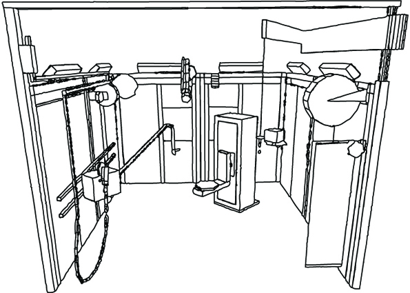
Figure 2 shows the welding workstation arrived at using the CAD system. It is a workplace which reduces the force and posture demands, and which meets nearly all the residual user demands put forward.
Figure 3. The welding workstation implemented
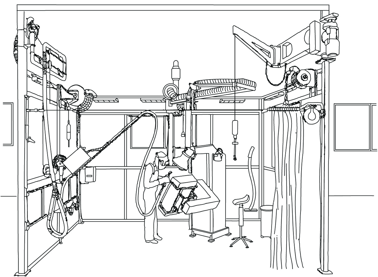
On the basis of the results of the first stages of the design process, a welding workplace (figure 3) was implemented. Assets of this workplace include:
- Work in the optimized zone is facilitated using a computerized handling device for welding objects. There is an overhead hoist for transportation purposes. As an alternative, a balanced lifting device is supplied for easy object handling.
- The welding gun and grinding machine are suspended, thus reducing force demands. They can be positioned anywhere around the welding object. A welding chair is supplied.
- All media come from above, which means that there are no cables on the floor.
- The workstation has lighting at three levels: general, workplace and process. The workplace lighting comes from ramps above the wall elements. The process lighting is integrated in the welding smoke ventilation arm.
- The workstation has ventilation at three levels: general displacement ventilation, workplace ventilation using a movable arm, and integrated ventilation in the MIG welding gun. The workplace ventilation is controlled from the welding gun.
- There are noise-absorbing wall elements on three sides of the workplace. A transparent welding curtain covers the fourth wall. This makes it possible for the welder to keep informed of what happens in the workshop environment.
In a real design situation, compromises of various kinds may have to be made, due to economic, space and other constraints. It should be noted, however, that licensed welders are hard to come by for the welding industry around the world, and they represent a considerable investment. Nearly no welders go into normal retirement as active welders. Keeping the skilled welder on the job is beneficial for all parties involved: welder, company and society. For instance, there are very good reasons why equipment for object handling and positioning should be an integral constituent of many welding workplaces.
Data for Workstation Design
In order to be able to design a workplace properly, extensive sets of basic information may be needed. Such information includes anthropometric data of user categories, lifting strength and other output force capacity data of male and female populations, specifications of what constitutes optimal working zones and so forth. In the present article, references to some key papers are given.
The most complete treatment of virtually all aspects of work and workstation design is probably still the textbook by Grandjean (1988). Information on a wide range of anthropometric aspects relevant to workstation design is presented by Pheasant (1986). Large amounts of biomechanical and anthropometric data are given by Chaffin and Andersson (1984). Konz (1990) has presented a practical guide to workstation design, including many useful rules of thumb. Evaluation criteria for the upper limb, particularly with reference to cumulative trauma disorders, have been presented by Putz-Anderson (1988). An assessment model for work with hand tools was given by Sperling et al. (1993). With respect to manual lifting, Waters and co-workers have developed the revised NIOSH equation, summarizing existing scientific knowledge on the subject (Waters et al. 1993). Specification of functional anthropometry and optimal working zones have been presented by, for example, Rebiffé, Zayana and Tarrière (1969) and Das and Grady (1983a, 1983b). Mital and Karwowski (1991) have edited a useful book reviewing various aspects relating in particular to the design of industrial workplaces.
The large amount of data needed to design workstations properly, taking all relevant aspects into account, will make necessary the use of modern information technology by production engineers and other responsible people. It is likely that various types of decision-support systems will be made available in the near future, for instance in the form of knowledge-based or expert systems. Reports on such developments have been given by, for example, DeGreve and Ayoub (1987), Laurig and Rombach (1989), and Pham and Onder (1992). However, it is an extremely difficult task to devise a system making it possible for the end-user to have easy access to all relevant data needed in a specific design situation.
Tools
Commonly a tool comprises a head and a handle, with sometimes a shaft, or, in the case of the power tool, a body. Since the tool must meet the requirements of multiple users, basic conflicts can arise which may have to be met with compromise. Some of these conflicts derive from limitations in the capacities of the user, and some are intrinsic to the tool itself. It should be remembered, however, that human limitations are inherent and largely immutable, while the form and function of the tool are subject to a certain amount of modification. Thus, in order to effect desirable change, attention must be directed primarily to the form of the tool, and, in particular, to the interface between the user and the tool, namely the handle.
The Nature of Grip
The widely accepted characteristics of grip have been defined in terms of a power grip, a precision grip and a hook grip, by which virtually all human manual activities can be accomplished.
In a power grip, such as is used in hammering nails, the tool is held in a clamp formed by the partially flexed fingers and the palm, with counterpressure being applied by the thumb. In a precision grip, such as one uses when adjusting a set screw, the tool is pinched between the flexor aspects of the fingers and the opposing thumb. A modification of the precision grip is the pencil grip, which is self-explanatory and is used for intricate work. A precision grip provides only 20% of the strength of a power grip.
A hook grip is used where there is no requirement for anything other than holding. In the hook grip the object is suspended from the flexed fingers, with or without the support of the thumb. Heavy tools should be designed so that they can be carried in a hook grip.
Grip Thickness
For precision grips, recommended thicknesses have varied from 8 to 16 millimetres (mm) for screwdrivers, and 13 to 30 mm for pens. For power grips applied around a more or less cylindrical object, the fingers should surround more than half the circumference, but the fingers and thumb should not meet. Recommended diameters have ranged from as low as 25 mm to as much as 85 mm. The optimum, varying with hand size, is probably around 55 to 65 mm for males, and 50 to 60 mm for females. Persons with small hands should not perform repetitive actions in power grips of diameter greater than 60 mm.
Grip Strength and Hand Span
The use of a tool requires strength. Other than for holding, the greatest requirement for hand strength is found in the use of cross-lever action tools such as pliers and crushing tools. The effective force in crushing is a function of the grip strength and the required span of the tool. The maximum functional span between the end of the thumb and the ends of the grasping fingers averages about 145 mm for men and 125 mm for women, with ethnic variations. For an optimal span, which ranges from 45 to 55 mm for both men and women, the grip strength available for a single short-term action ranges from about 450 to 500 newtons for men and 250 to 300 newtons for women, but for repetitive action the recommended requirement is probably closer to 90 to 100 newtons for men, and 50 to 60 newtons for women. Many commonly used clamps or pliers are beyond the capacity of one-handed use, particularly in women.
When a handle is that of a screwdriver or similar tool the available torque is determined by the user’s ability to transmit force to the handle, and thus is determined by both the coefficient of friction between hand and handle and the diameter of the handle. Irregularities in the shape of the handle make little or no difference to the ability to apply torque, although sharp edges can cause discomfort and eventual tissue damage. The diameter of a cylindrical handle that allows the greatest application of torque is 50 to 65 mm, while that for a sphere is 65 to 75 mm.
Handles
Shape of handle
The shape of a handle should maximize contact between skin and handle. It should be generalized and basic, commonly of flattened cylindrical or elliptical section, with long curves and flat planes, or a sector of a sphere, put together in such a manner as to conform to the general contours of the grasping hand. Because of its attachment to the body of a tool, the handle may also take the form of a stirrup, a T-shape or an L-shape, but the portion that contacts the hand will be in the basic form.
The space enclosed by the fingers is, of course, complex. The use of simple curves is a compromise intended to meet the variations represented by different hands and different degrees of flexion. In this regard, it is undesirable to introduce any contour matching of flexed fingers into the handle in the form of ridges and valleys, flutings and indentations, since, in fact, these modifications would not fit a significant number of hands and might indeed, over a prolonged period, cause pressure injury to the soft tissues. In particular, recesses of greater that 3 mm are not recommended.
A modification of the cylindrical section is the hexagonal section, which is of particular value in the design of small calibre tools or instruments. It is easier to maintain a stable grip on a hexagonal section of small calibre than on a cylinder. Triangular and square sections have also been used with varying degrees of success. In these cases, the edges must be rounded to avert pressure injury.
Grip Surface and Texture
It is not by accident that for millennia wood has been the material of choice for tool handles other than those for crushing tools like pliers or clamps. In addition to its aesthetic appeal, wood has been readily available and easily worked by unskilled workers, and has qualities of elasticity, thermal conductivity, frictional resistance and relative lightness in relation to bulk that have made it very acceptable for this and other uses.
In recent years, metal and plastic handles have become more common for many tools, the latter in particular for use with light hammers or screwdrivers. A metal handle, however, transmits more force to the hand, and preferably should be encased in a rubber or plastic sheath. The grip surface should be slightly compressible, where feasible, nonconductive and smooth, and the surface area should be maximized to ensure pressure distribution over as large an area as possible. A foam rubber grip has been used to reduce the perception of hand fatigue and tenderness.
The frictional characteristics of the tool surface vary with the pressure exerted by the hand, with the nature of the surface and contamination by oil or sweat. A small amount of sweat increases the coefficient of friction.
Length of handle
The length of the handle is determined by the critical dimensions of the hand and the nature of the tool. For a hammer to be used by one hand in a power grip, for example, the ideal length ranges from a minimum of about 100 mm to a maximum of about 125 mm. Short handles are unsuitable for a power grip, while a handle shorter than 19 mm cannot be properly grasped between thumb and forefinger and is unsuitable for any tool.
Ideally, for a power tool, or a hand saw other than a coping or fret saw, the handle should accommodate at the 97.5th percentile level the width of the closed hand thrust into it, namely 90 to 100 mm in the long axis and 35 to 40 mm in the short.
Weight and Balance
Weight is not a problem with precision tools. For heavy hammers and power tools a weight between 0.9 kg and 1.5 kg is acceptable, with a maximum of about 2.3 kg. For weights greater than recommended, the tool should be supported by mechanical means.
In the case of a percussion tool such as a hammer, it is desirable to reduce the weight of the handle to the minimum compatible with structural strength and have as much weight as possible in the head. In other tools, the balance should be evenly distributed where possible. In tools with small heads and bulky handles this may not be possible, but the handle should then be made progressively lighter as the bulk increases relative to the size of the head and shaft.
Significance of Gloves
It is sometimes overlooked by tool designers that tools are not always held and operated by bare hands. Gloves are commonly worn for safety and comfort. Safety gloves are seldom bulky, but gloves worn in cold climates may be very heavy, interfering not only with sensory feedback but also with the ability to grasp and hold. The wearing of woollen or leather gloves can add 5 mm to hand thickness and 8 mm to hand breadth at the thumb, while heavy mittens can add as much as 25 to 40 mm respectively.
Handedness
The majority of the population in the western hemisphere favours the use of the right hand. A few are functionally ambidextrous, and all persons can learn to operate with greater or less efficiency with either hand.
Although the number of left-handed persons is small, wherever feasible the fitting of handles to tools should make the tool workable by either left-handed or right-handed persons (examples would include the positioning of the secondary handle in a power tool or the finger loops in scissors or clamps) unless it is clearly inefficient to do so, as in the case of screw-type fasteners which are designed to take advantage of the powerful supinating muscles of the forearm in a right-handed person while precluding the left-hander from using them with equal effectiveness. This sort of limitation has to be accepted since the provision of left-hand threads is not an acceptable solution.
Significance of Gender
In general, women tend to have smaller hand dimensions, smaller grasp and some 50 to 70% less strength than men, although of course a few women at the higher percentile end have larger hands and greater strength than some men at the lower percentile end. As a result there exists a significant although undetermined number of persons, mostly female, who have difficulty in manipulating various hand tools which have been designed with male use in mind, including in particular heavy hammers and heavy pliers, as well as metal cutting, crimping and clamping tools and wire strippers. The use of these tools by women may require an undesirable two-handed instead of single-handed function. In a mixed-gender workplace it is therefore essential to ensure that tools of suitable size are available not only to meet the requirements of women, but also to meet those of men who are at the low percentile end of hand dimensions.
Special considerations
The orientation of a tool handle, where feasible, should allow the operating hand to conform to the natural functional position of the arm and hand, namely with the wrist more than half-supinated, abducted about 15° and slightly dorsiflexed, with the little finger in almost full flexion, the others less so and the thumb adducted and slightly flexed, a posture sometimes erroneously called the handshake position. (In a handshake the wrist is not more than half-supinated.) The combination of adduction and dorsiflexion at the wrist with varying flexion of the fingers and thumb generates an angle of grasp comprising about 80° between the long axis of the arm and a line passing through the centre point of the loop created by the thumb and index finger, that is, the transverse axis of the fist.
Forcing the hand into a position of ulnar deviation, that is, with the hand bent towards the little finger, as is found in using a standard pliers, generates pressure on the tendons, nerves and blood vessels within the wrist structure and can give rise to the disabling conditions of tenosynovitis, carpal tunnel syndrome and the like. By bending the handle and keeping the wrist straight, (that is, by bending the tool and not the hand) compression of nerves, soft tissues and blood vessels can be avoided. While this principle has been long recognized, it has not been widely accepted by tool manufacturers or the using public. It has particular application in the design of cross-lever action tools such as pliers, as well as knives and hammers.
Pliers and cross-lever tools
Special consideration must be given to the shape of the handles of pliers and similar devices. Traditionally pliers have had curved handles of equal length, the upper curve approximating the curve of the palm of the hand and the lower curve approximating the curve of the flexed fingers. When the tool is held in the hand, the axis between the handles is in line with the axis of the jaws of the pliers. Consequently, in operation, it is necessary to hold the wrist in extreme ulnar deviation, that is, bent towards the little finger, while it is being repeatedly rotated. In this position the use of the hand-wrist-arm segment of the body is extremely inefficient and very stressful on the tendons and joint structures. If the action is repetitive it may give rise to various manifestations of overuse injury.
To counter this problem a new and ergonomically more suitable version of pliers has appeared in recent years. In these pliers the axis of the handles is bent through approximately 45° relative to the axis of the jaws. The handles are thickened to allow a better grasp with less localized pressure on the soft tissues. The upper handle is proportionately longer with a shape that fits into, and around the ulnar side of, the palm. The forward end of the handle incorporates a thumb support. The lower handle is shorter, with a tang, or rounded projection, at the forward end and a curve conforming to the flexed fingers.
While the foregoing is a somewhat radical change, several ergonomically sound improvements can be made in pliers relatively easily. Perhaps the most important, where a power grip is required, is in the thickening and slight flattening of the handles, with a thumb support at the head-end of the handle and a slight flare at the other end. If not integral to the design, this modification can be achieved by encasing the basic metal handle with a fixed or detachable non-conductive sheath made of rubber or an appropriate synthetic material, and perhaps bluntly roughened to improve the tactile quality. Indentation of the handles for fingers is undesirable. For repetitive use it may be desirable to incorporate a light spring into the handle to open it after closing.
The same principles apply to other cross-lever tools, particularly with respect to change in the thickness and flattening of the handles.
Knives
For a general purpose knife, that is, one that is not used in a dagger grasp, it is desirable to include a 15° angle between handle and blade to reduce the stress on joint tissues. The size and shape of handles should conform in general to that for other tools, but to allow for different hand sizes it has been suggested that two sizes of knife handle should be supplied, namely one to fit the 50th to 95th percentile user, and one for the 5th to 50th percentile. To allow the hand to exert force as close to the blade as possible the top surface of the handle should incorporate a raised thumb rest.
A knife guard is required to prevent the hand from slipping forward onto the blade. The guard may take several forms, such as a tang, or curved projection, about 10 to 15 mm in length, protruding downwards from the handle, or at right angles to the handle, or a bail guard comprising a heavy metal loop from front to rear of the handle. The thumb rest also acts to prevent slippage.
The handle should conform to general ergonomic guidelines, with a yielding surface resistant to grease.
Hammers
The requirements for hammers have been largely considered above, with the exception of that relating to bending the handle. As noted above, forced and repetitive bending of the wrist may cause tissue damage. By bending the tool instead of the wrist this damage may be reduced. With respect to hammers various angles have been examined, but it would appear that bending the head downward between 10° and 20° may improve comfort, if it does not actually improve performance.
Screwdrivers and scraping tools
The handles of screwdrivers and other tools held in a somewhat similar manner, such as scrapers, files, hand chisels and so on, have some special requirements. Each at one time or another is used with a precision grip or a power grip. Each relies on the functions of the fingers and the palm of the hand for stabilization and the transmission of force.
The general requirements of handles have already been considered. The most common effective shape of a screwdriver handle has been found to be that of a modified cylinder, dome-shaped at the end to receive the palm, and slightly flared where it meets the shaft to provide support to the ends of the fingers. In this manner, torque is applied largely by way of the palm, which is maintained in contact with the handle by way of pressure applied from the arm and the frictional resistance at the skin. The fingers, although transmitting some force, occupy more of a stabilizing role, which is less fatiguing since less power is required. Thus the dome of the head becomes very important in handle design. If there are sharp edges or ridges on the dome or where the dome meets the handle, then either the hand becomes callused and injured, or the transmission of force is transferred towards the less efficient and more readily fatigued fingers and thumb. The shaft is commonly cylindrical, but a triangular shaft has been introduced which provides better support for the fingers, although its use may be more fatiguing.
Where the use of a screwdriver or other fastener is so repetitive as to comprise an overuse injury hazard the manual driver should be replaced with a powered driver slung from an overhead harness in such a manner as to be readily accessible without obstructing the work.
Saws and power tools
Hand saws, with the exception of fret saws and light hacksaws, where a handle like that of a screwdriver is most appropriate, commonly have a handle which takes the form of a closed pistol grip attached to the blade of the saw.
The handle essentially comprises a loop into which the fingers are placed. The loop is effectively a rectangle with curved ends. To allow for gloves it should have internal dimensions of approximately 90 to 100 mm in the long diameter and 35 to 40 mm in the short. The handle in contact with the palm should have the flattened cylindrical shape already mentioned, with compound curves to reasonably fit the palm and the flexed fingers. The width from outer curve to inner curve should be about 35 mm, and the thickness not more than 25 mm.
Curiously, the function of grasping and holding a power tool is very similar to that of holding a saw, and consequently a somewhat similar type of handle is effective. The pistol grip common in power tools is akin to an open saw handle with the sides being curved instead of being flattened.
Most power tools comprise a handle, a body and a head. Placement of the handle is significant. Ideally handle, body and head should be in line so that the handle is attached at the rear of the body and the head protrudes from the front. The line of action is the line of the extended index finger, so that the head is eccentric to the central axis of the body. The centre of mass of the tool, however, is in front of the handle, while the torque is such as to create a turning movement of the body which the hand must overcome. Consequently it would be more appropriate to place the primary handle directly under the centre of mass in such a way that, if necessary, the body juts out behind the handle as well as in front. Alternatively, particularly in a heavy drill, a secondary handle can be placed underneath the drill in such a manner that the drill can be operated with either hand. Power tools are normally operated by a trigger incorporated into the upper front end of the handle and operated by the index finger. The trigger should be designed to be operated by either hand and should incorporate an easily reset latching mechanism to hold the power on when required.
Controls, Indicators and Panels
Karl H. E. Kroemer
In what follows, three of the most important concerns of ergonomic design will be examined: first, that of controls, devices to transfer energy or signals from the operator to a piece of machinery; second, indicators or displays, which provide visual information to the operator about the status of the machinery; and third, the combination of controls and displays in a panel or console.
Designing for the Sitting Operator
Sitting is a more stable and less energy-consuming posture than standing, but it restricts the working space, particularly of the feet, more than standing. However, it is much easier to operate foot controls when sitting, as compared to standing, because little body weight must be transferred by the feet to the ground. Furthermore, if the direction of the force exerted by the foot is partly or largely forward, provision of a seat with a backrest allows the exertion of rather large forces. (A typical example of this arrangement is the location of pedals in an automobile, which are located in front of the driver, more or less below seat height.) Figure 1 shows schematically the locations in which pedals may be located for a seated operator. Note that the specific dimensions of that space depend on the anthropometry of the actual operators.
Figure 1. Preferred and regular workspace for feet (in centimetres)
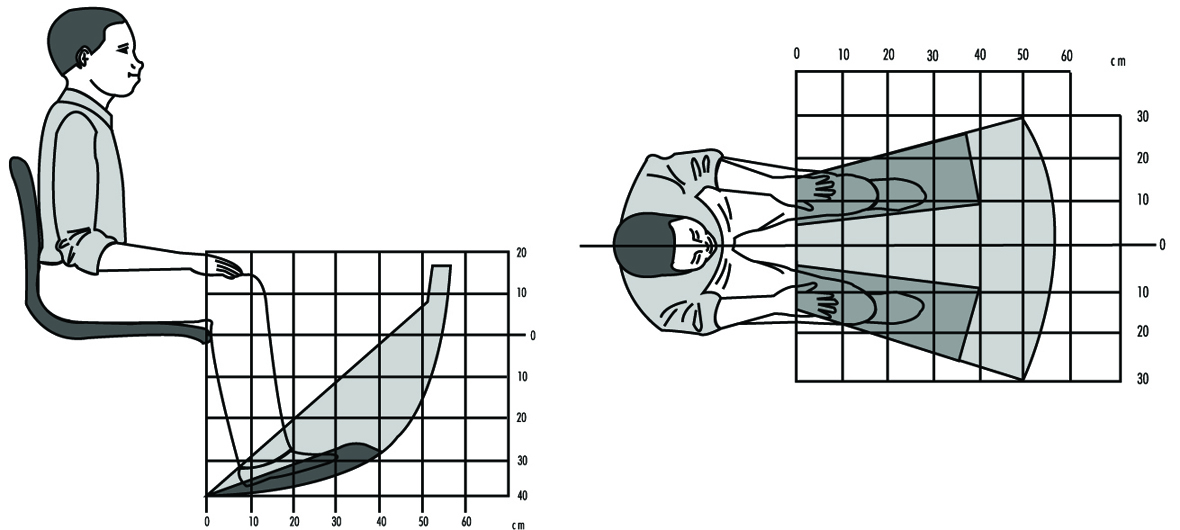
The space for the positioning of hand-operated controls is primarily located in front of the body, within a roughly spherical contour that is centred at either the elbow, at the shoulder, or somewhere between those two body joints. Figure 2 shows schematically that space for the location of controls. Of course, the specific dimensions depend on the anthropometry of the operators.
Figure 2. Preferred and regular workspace for hands (in centimetres)

The space for displays and for controls that must be looked at is bounded by the periphery of a partial sphere in front of the eyes and centred at the eyes. Thus, the reference height for such displays and controls depends on the eye height of the seated operator and on his or her trunk and neck postures. The preferred location for visual targets closer than about one metre is distinctly below the height of the eye, and depends on the closeness of the target and on the posture of the head. The closer the target, the lower it should be located, and it should be in or near the medial (mid-sagittal) plane of the operator.
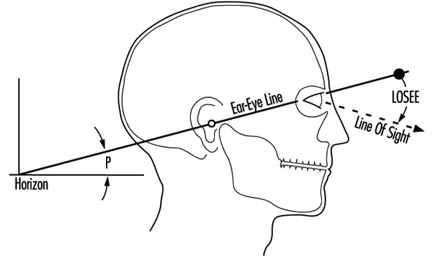
It is convenient to describe the posture of the head by using the “ear-eye line” (Kroemer 1994a) which, in the side view, runs through the right ear hole and the juncture of the lids of the right eye, while the head is not tilted to either side (the pupils are at the same horizontal level in the frontal view). One usually calls the head position “erect” or “upright” when the pitch angle P (see figure 3) between the ear-eye line and the horizon is about 15°, with the eyes above the height of the ear. The preferred location for visual targets is 25°–65° below the ear-eye line (LOSEE in figure 3), with the lower values preferred by most people for close targets that must be kept in focus. Even though there are large variations in the preferred angles of the line of sight, most subjects, particularly as they become older, prefer to focus on close targets with large LOSEE angles.
Designing for the Standing Operator
Pedal operation by a standing operator should be seldom required, because otherwise the person must spend too much time standing on one foot while the other foot operates the control. Obviously, simultaneous operation of two pedals by a standing operator is practically impossible. While the operator is standing still, the room for the location of foot controls is limited to a small area below the trunk and slightly in front of it. Walking about would provide more room to place pedals, but that is highly impractical in most cases because of the walking distances involved.
The location for hand-operated controls of a standing operator includes about the same area as for a seated operator, roughly a half sphere in front of the body, with its centre near the shoulders of the operator. For repeated control operations, the preferred part of that half sphere would be its lower section. The area for the location of displays is also similar to the one suited to a seated operator, again roughly a half sphere centred near the operator’s eyes, with the preferred locations in the lower section of that half sphere. The exact locations for displays, and also for controls that must be seen, depends on the posture of the head, as discussed above.
The height of controls is appropriately referenced to the height of the elbow of the operator while the upper arm is hanging from the shoulder. The height of displays and controls that must be looked at is referred to the eye height of the operator. Both depend on the operator’s anthropometry, which may be rather different for short and tall persons, for men and women, and for people of different ethnic origins.
Foot-operated Controls
Two kinds of controls should be distinguished: one is used to transfer large energy or forces to a piece of machinery. Examples of this are the pedals on a bicycle or the brake pedal in a heavier vehicle that does not have a power-assist feature. A foot-operated control, such as an on-off switch, in which a control signal is conveyed to the machinery, usually requires only a small quantity of force or energy. While it is convenient to consider these two extremes of pedals, there are various intermediate forms, and it is the task of the designer to determine which of the following design recommendations apply best among them.
As mentioned above, repeated or continual pedal operation should be required only from a seated operator. For controls meant to transmit large energies and forces, the following rules apply:
- Locate pedals underneath the body, slightly in front, so that they can be operated with the leg in a comfortable position. The total horizontal displacement of a reciprocating pedal should normally not exceed about 0.15 m. For rotating pedals, the radius should also be about 0.15 m. The linear displacement of a switch-type pedal may be minimal and should not exceed about 0.15 m.
- Pedals should be so designed that the direction of travel and the foot force are approximately in the line extending from the hip through the ankle joint of the operator.
- Pedals that are operated by flexion and extension of the foot in the ankle joint should be so arranged that in the normal position the angle between the lower leg and the foot is approximately 90°; during operation, that angle may be increased to about 120°.
- Foot-operated controls that simply provide signals to the machinery should normally have two discrete positions, such as ON or OFF. Note, however, that tactile distinction between the two positions may be difficult with the foot.
Selection of Controls
Selection among different sorts of controls must be made according to the following needs or conditions:
- Operation by hand or foot
- Amounts of energies and forces transmitted
- Applying “continuous” inputs, such as steering an automobile
- Performing “discrete actions,” for example, (a) activating or shutting down equipment, (b) selecting one of several distinct adjustments, such as switching from one TV or radio channel to another, or (c) carrying out data entry, as with a keyboard.
The functional usefulness of controls also determines selection procedures. The main criteria are as follows:
- The control type shall be compatible with stereotypical or common expectations (for instance, using a push-button or toggle switch to turn on an electric light, not a rotary knob).
- Size and motion characteristics of the control shall be compatible with stereotypical experience and past practice (for instance, providing a large steering wheel for the two-handed operation of an automobile, not a lever).
- The direction of operation of a control shall be compatible with stereotypical or common expectations (for instance, an ON control is pushed or pulled, not turned to the left).
- Hand operation is used for controls that require small force and fine adjustment, while foot operation is suitable for gross adjustments and large forces (however, consider the common use of pedals, particularly accelerator pedals, in automobiles, which does not comply with this principle).
- The control shall be “safe” in that it cannot be operated inadvertently nor in ways that are excessive or inconsistent with its intended purpose.
Table 1. Control movements and expected effects
|
Direction of control movement |
||||||||||||
|
Function |
Up |
Right |
Forward |
Clockwise |
Press, |
Down |
Left |
Rearward |
Back |
Counter- |
Pull1 |
Push2 |
|
On |
+3 |
+ |
+ |
+ |
– |
+3 |
+ |
|||||
|
Off |
+ |
– |
– |
+ |
– |
|||||||
|
Right |
+ |
– |
||||||||||
|
Left |
+ |
– |
||||||||||
|
Raise |
+ |
– |
||||||||||
|
Lower |
– |
+ |
||||||||||
|
Retract |
– |
+ |
– |
|||||||||
|
Extend |
+ |
– |
– |
|||||||||
|
Increase |
– |
– |
+ |
– |
||||||||
|
Decrease |
– |
– |
+ |
– |
||||||||
|
Open Value |
– |
+ |
||||||||||
|
Close Value |
+ |
– |
||||||||||
Blank: Not applicable; + Most preferred; – less preferred. 1 With trigger-type control. 2 With push-pull switch. 3 Up in the United States, down in Europe.
Source: Modified from Kroemer 1995.
Table 1 and table 2 help in the selection of proper controls. However, note that there are few “natural” rules for selection and design of controls. Most current recommendations are purely empirical and apply to existing devices and Western stereotypes.
Table 2. Control-effect relations of common hand controls
|
Effect |
Key- |
Toggle |
Push- |
Bar |
Round |
Thumbwheel |
Thumbwheel |
Crank |
Rocker switch |
Lever |
Joystick |
Legend |
Slide1 |
|
Select ON/OFF |
+ |
+ |
+ |
= |
+ |
+ |
+ |
||||||
|
Select ON/STANDBY/OFF |
– |
+ |
+ |
+ |
+ |
+ |
|||||||
|
Select OFF/MODE1/MODE2 |
= |
– |
+ |
+ |
+ |
+ |
|||||||
|
Select one function of several related functions |
– |
+ |
– |
= |
|||||||||
|
Select one of three or more discrete alternatives |
+ |
+ |
|||||||||||
|
Select operating condition |
+ |
+ |
– |
+ |
+ |
– |
|||||||
|
Engage or disengage |
+ |
||||||||||||
|
Select one of mutually |
+ |
+ |
|||||||||||
|
Set value on scale |
+ |
– |
= |
= |
= |
+ |
|||||||
|
Select value in discrete steps |
+ |
+ |
+ |
+ |
Blank: Not applicable; +: Most preferred; –: Less preferred; = Least preferred. 1 Estimated (no experiments known).
Source: Modified from Kroemer 1995.
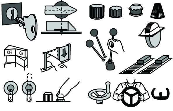
Figure 4 presents examples of “detent” controls, characterized by discrete detents or stops in which the control comes to rest. It also depicts typical “continuous” controls where the control operation may take place anywhere within the adjustment range, without the need to be set in any given position.
Figure 4. Some examples of "detent" and "continuous" controls
The sizing of controls is largely a matter of past experiences with various control types, often guided by the desire to minimize the needed space in a control panel, and either to allow simultaneous operations of adjacent controls or to avoid inadvertent concurrent activation. Furthermore, the choice of design characteristics will be influenced by such considerations as whether the controls are to be located outdoors or in sheltered environments, in stationary equipment or moving vehicles, or may involve the use of bare hands or of gloves and mittens. For these conditions, consult readings at the end of the chapter.
Several operational rules govern the arrangement and grouping of controls. These are listed in table 3. For more details, check the references listed at the end of this section and Kroemer, Kroemer and Kroemer-Elbert (1994).
Table 3. Rules for arrangement of controls
|
Locate for the |
Controls shall be oriented with respect to the operator. If the |
|
Primary controls |
The most important controls shall have the most advantageous |
|
Group related |
Controls that are operated in sequence, that are related to a |
|
Arrange for |
If operation of controls follows a given pattern, controls shall |
|
Be consistent |
The arrangement of functionally identical or similar controls |
|
Dead-operator |
If the operator becomes incapacitated and either lets go of a |
|
Select codes |
There are numerous ways to help identify controls, to indicate |
Source: Modified from Kroemer, Kroemer and Kroemer-Elbert 1994.
Reproduced by permission of Prentice-Hall. All rights reserved.
Preventing Accidental Operation
The following are the most important means to guard against inadvertent activation of controls, some of which may be combined:
- Locate and orient the control so that the operator is unlikely to strike it or move it accidentally in the normal sequence of control operations.
- Recess, shield or surround the control by physical barriers.
- Cover the control or guard it by providing a pin, a lock or other means that must be removed or broken before the control can be operated.
- Provide extra resistance (by viscous or coulomb friction, by spring-loading or by inertia) so that an unusual effort is required for actuation.
- Provide a “delaying” means so that the control must pass through a critical position with an unusual movement (such as in the gear shift mechanism of an automobile).
- Provide interlocking between controls so that prior operation of a related control is required before the critical control can be activated.
Note that these designs usually slow the operation of controls, which may be detrimental in case of an emergency.
Data Entry Devices
Nearly all controls can be used to enter data on a computer or other data storage device. However, we are most used to the practice of using a keyboard with push-buttons. On the original typewriter keyboard, which has become the standard even for computer keyboards, the keys were arranged in a basically alphabetic sequence, which has been modified for various, often obscure, reasons. In some cases, letters which frequently follow each other in common text were spaced apart so that the original mechanical type bars might not entangle if struck in rapid sequence. “Columns” of keys run in roughly straight lines, as do the “rows” of keys. However, the fingertips are not aligned in such manners, and do not move in this way when digits of the hand are flexed or extended, or moved sideways.
Many attempts have been made over the last hundred years to improve keying performance by changing the keyboard layout. These include relocating keys within the standard layout, or changing the keyboard layout altogether. The keyboard has been divided into separate sections, and sets of keys (such as numerical pads) have been added. Arrangements of adjacent keys may be changed by altering spacing, offset from each other or from reference lines. The keyboard may be divided into sections for the left and right hand, and those sections may be laterally tilted and sloped and slanted.
The dynamics of the operation of push-button keys are important for the user, but are difficult to measure in operation. Thus, the force-displacement characteristics of keys are commonly described for static testing, which is not indicative of actual operation. By current practise, keys on computer keyboards have fairly little displacement (about 2 mm) and display a “snap-back” resistance, that is, a decrease in operation force at the point when actuation of the key has been achieved. Instead of separate single keys, some keyboards consist of a membrane with switches underneath which, when pressed in the correct location, generate the desired input with little or no displacement felt. The major advantage of the membrane is that dust or fluids cannot penetrate it; however, many users dislike it.
There are alternatives to the “one key-one character” principle; instead, one can generate inputs by various combinatory means. One is “chording”, meaning that two or more controls are operated simultaneously to generate one character. This poses demands on the memory capabilities of the operator, but requires the use of only very few keys. Other developments utilize controls other than the binary tapped push button, replacing it by levers, toggles or special sensors (such as an instrumented glove) which respond to movements of the digits of the hand.
By tradition, typing and computer entry have been made by mechanical interaction between the operator’s fingers and such devices as keyboard, mouse, track ball or light pen. Yet there are many other means to generate inputs. Voice recognition appears one promising technique, but other methods can be employed. They might utilize, for example, pointing, gestures, facial expressions, body movements, looking (directing one’s gaze), movements of the tongue, breathing or sign language to transmit information and to generate inputs to a computer. Technical development in this area is very much in flux, and as the many nontraditional input devices used for computer games indicate, acceptance of devices other than the traditional binary tap-down keyboard is entirely feasible within the near future. Discussions of current keyboard devices have been provided, for example, by Kroemer (1994b) and McIntosh (1994).
Displays
Displays provide information about the status of equipment. Displays may apply to the operator’s visual sense (lights, scales, counters, cathode-ray tubes, flat panel electronics, etc.), to the auditory sense (bells, horns, recorded voice messages, electronically generated sounds, etc.) or to the sense of touch (shaped controls, Braille, etc.). Labels, written instructions, warnings or symbols (“icons”) may be considered special kinds of displays.
The four “cardinal rules” for displays are:
- Display only that information which is essential for adequate job performance.
- Display information only as accurately as is required for the operator’s decisions and actions.
- Present information in the most direct, simple, understandable and usable form.
- Present information in such a way that failure or malfunction of the display itself will be immediately obvious.
The selection of either an auditory or visual display depends on the prevailing conditions and purposes. The objective of the display may be to provide:
- historical information about the past state of the system, such as the course run by a ship
- status information about the current state of the system, such as the text already input into a word processor or the current position of an airplane
- predictive information, such as on the future position of a ship, given certain steering settings
- instructions or commands telling the operator what to do, and possibly how to do it.
A visual display is most appropriate if the environment is noisy, the operator stays in place, the message is long and complex, and especially if it deals with the spatial location of an object. An auditory display is appropriate if the workplace must be kept dark, the operator moves around, and the message is short and simple, requires immediate attention, and deals with events and time.
Visual Displays
There are three basic types of visual displays: (1)The check display indicates whether or not a given condition exists (for example a green light indicates normal function). (2)The qualitative display indicates the status of a changing variable or its approximate value, or its trend of change (for example, a pointer moves within a “normal” range). (3) The quantitative display shows exact information that must be ascertained (for example, to find a location on a map, to read text or to draw on a computer monitor), or it may indicate an exact numerical value that must be read by the operator (for example, a time or a temperature).
Design guidelines for visual displays are:
- Arrange displays so that the operator can locate and identify them easily without unnecessary searching. (This usually means that the displays should be in or near the medial plane of the operator, and below or at eye height.)
- Group displays functionally or sequentially so that the operator can use them easily.
- Make sure that all displays are properly illuminated or illuminant, coded and labelled according to their function.
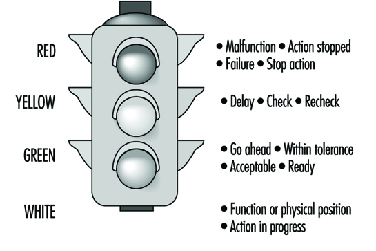
- Use lights, often coloured, to indicate the status of a system (such as ON or OFF) or to alert the operator that the system, or a subsystem, is inoperative and that special action must be taken. Common meanings of light colours are listed in figure 5. Flashing red indicates an emergency condition that requires immediate action. An emergency signal is most effective when it combines sounds with a flashing red light.
Figure 5. Colour coding of indicator lights
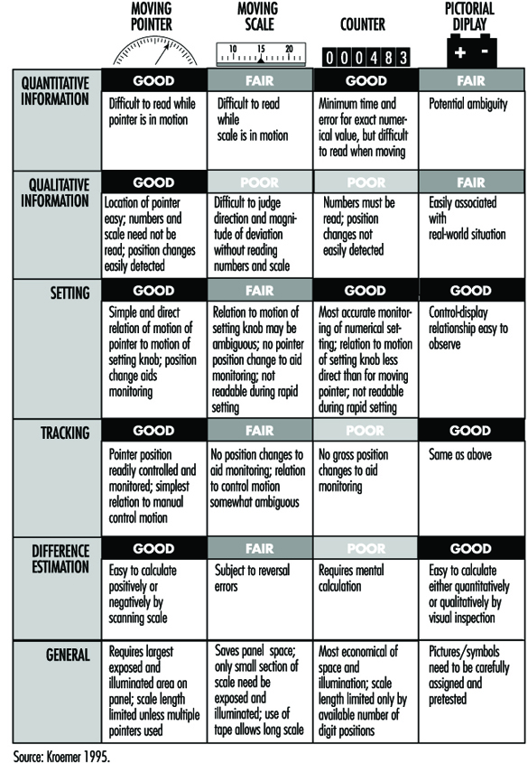
For more complex and detailed information, especially quantitative information, one of four different kinds of displays are traditionally used: (1) a moving pointer (with fixed scale), (2) a moving scale (with fixed pointer), (3) counters or (4) “pictorial” displays, especially computer-generated on a display monitor. Figure 6 lists the major characteristics of these display types.
Figure 6. Characteristics of displays
It is usually preferable to use a moving pointer rather than a moving scale, with the scale either straight (horizontally or vertically arranged), curved or circular. Scales should be simple and uncluttered, with graduation and numbering so designed that correct readings can be taken quickly. Numerals should be located outside the scale markings so that they are not obscured by the pointer. The pointer should end with its tip directly at the marking. The scale should mark divisions only so finely as the operator must read. All major marks should be numbered. Progressions are best marked with intervals of one, five or ten units between major marks. Numbers should increase left to right, bottom to top or clockwise. For details of dimensions of scales refer to standards such as those listed by Cushman and Rosenberg 1991 or Kroemer 1994a.
Starting in the 1980s, mechanical displays with pointers and printed scales were increasingly replaced by “electronic” displays with computer-generated images, or solid-state devices using light-emitting diodes (see Snyder 1985a). The displayed information may be coded by the following means:
- shapes, such as straight or circular
- alphanumeric, that is, letters, numbers, words, abbreviations
- figures, pictures, pictorials, icons, symbols, in various levels of abstraction, such as the outline of an airplane against the horizon
- shades of black, white or gray
- colours.
Unfortunately, many electronically generated displays have been fuzzy, often overly complex and colourful, hard to read, and required exact focusing and close attention, which may distract from the main task, for example, driving a car. In these cases the first three of the four “cardinal rules” listed above were often violated. Furthermore, many electronically generated pointers, markings and alphanumerics did not comply with established ergonomic design guidelines, especially when generated by line segments, scan lines or dot matrices. Although some of these defective designs were tolerated by the users, rapid innovation and improving display techniques allows many better solutions. However, the same rapid development leads to the fact that printed statements (even if current and comprehensive when they appear) are becoming obsolete quickly. Therefore, none are given in this text. Compilations have been published by Cushman and Rosenberg (1991), Kinney and Huey (1990), and Woodson, Tillman and Tillman (1991).
The overall quality of electronic displays is often wanting. One measure used to assess the image quality is the modulation transfer function (MTF) (Snyder 1985b). It describes the resolution of the display using a special sine-wave test signal; yet, readers have many criteria regarding the preference of displays (Dillon 1992).
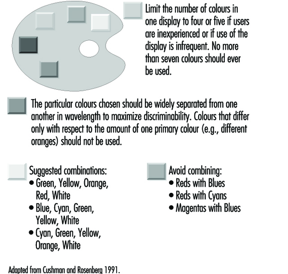
Monochrome displays have only one colour, usually either green, yellow, amber, orange or white (achromatic). If several colours appear on the same chromatic display, they should be easily discriminated. It is best to display not more than three or four colours simultaneously (with preference being given to red, green, yellow or orange, and cyan or purple). All should strongly contrast with the background. In fact, a suitable rule is to design first by contrast, that is, in terms of black and white, and then to add colours sparingly.
In spite of the many variables that, singly and interacting with each other, affect the use of complex colour display, Cushman and Rosenberg (1991) compiled guidelines for use of colour in displays; these are listed in figure 7.
Figure 7. Guidelines for use of colours in displays
Other suggestions are as follows:
- Blue (preferably desaturated) is a good colour for backgrounds and large shapes. However, blue should not be used for text, thin lines or small shapes.
- The colour of alphanumeric characters should contrast with that of the background.
- When using colour, use shape as a redundant cue (e.g., all yellow symbols are triangles, all green symbols are circles, all red symbols are squares). Redundant coding makes the display much more acceptable for users who have colour-vision deficiencies.
- As the number of colours is increased, the sizes of the colour-coded objects should also be increased.
- Red and green should not be used for small symbols and small shapes in peripheral areas of large displays.
- Using opponent colours (red and green, yellow and blue) adjacent to one another or in an object/background relationship is sometimes beneficial and sometimes detrimental. No general guidelines can be given; a solution should be determined for each case.
- Avoid displaying several highly saturated, spectrally extreme colours at the same time.
Panels of Controls and Displays
Displays as well as controls should be arranged in panels so they are in front of the operator, that is, close to the person’s medial plane. As discussed earlier, controls should be near elbow height, and displays below or at eye height, whether the operator is sitting or standing. Infrequently operated controls, or less important displays, can be located further to the sides, or higher.
Often, information on the result of control operation is displayed on an instrument. In this case, the display should be located close to the control so that the control setting can be done without error, quickly and conveniently. The assignment is usually clearest when the control is directly below or to the right of the display. Care must be taken that the hand does not cover the display when operating the control.
Popular expectancies of control-display relations exist, but they are often learned, they may depend on the user’s cultural background and experience, and these relationships are often not strong. Expected movement relationships are influenced by the type of control and display. When both are either linear or rotary, the stereotypical expectation is that they move in corresponding directions, such as both up or both clockwise. When the movements are incongruent, in general the following rules apply:
- Clockwise for increase. Turning the control clockwise causes an increase in the displayed value.
- Warrick’s gear-slide rule. A display (pointer) is expected to move in the same direction as does the side of the control close to (i.e., geared with) the display.
The ratio of control and display displacement (C/D ratio or D/C gain) describes how much a control must be moved to adjust a display. If much control movement produces only a small display motion, once speaks of a high C/D ratio, and of the control as having low sensitivity. Often, two distinct movements are involved in making a setting: first a fast primary (“slewing”) motion to an approximate location, then a fine adjustment to the exact setting. In some cases, one takes as the optimal C/D ratio that which minimizes the sum of these two movements. However, the most suitable ratio depends on the given circumstances; it must be determined for each application.
Labels and Warnings
Labels
Ideally, no label should be required on equipment or on a control to explain its use. Often, however, it is necessary to use labels so that one may locate, identify, read or manipulate controls, displays or other equipment items. Labelling must be done so that the information is provided accurately and rapidly. For this, the guidelines in table 4 apply.
Table 4. Guidelines for labels
|
Orientation |
A label and the information printed on it shall be oriented |
|
Location |
A label shall be placed on or very near the item that it |
|
Standardization |
Placement of all labels shall be consistent throughout the |
|
Equipment |
A label shall primarily describe the function (“what does it |
|
Abbreviations |
Common abbreviations may be used. If a new abbreviation is |
|
Brevity |
The label inscription shall be as concise as possible without |
|
Familiarity |
Words shall be chosen, if possible, that are familiar to the |
|
Visibility and |
The operator shall be able to be read easily and accurately at |
|
Font and size |
Typography determines the legibility of written information; |
Source: Modified from Kroemer, Kroemer and Kroemer-Elbert 1994
(reproduced by permission of Prentice-Hall; all rights reserved).
Font (typeface) should be simple, bold and vertical, such as Futura, Helvetica, Namel, Tempo and Vega. Note that most electronically generated fonts (formed by LED, LCD or dot matrix) are generally inferior to printed fonts; thus, special attention must be paid to making these as legible as possible.
- The height of characters depends on the viewing distance:
viewing distance 35 cm, suggested height 22 mm
viewing distance 70 cm, suggested height 50 mm
viewing distance 1 m, suggested height 70 mm
viewing distance 1.5 m, suggested height at least 1 cm.
- The ratio of strokewidth to character height should be between 1:8 to 1:6 for black letters on white background, and 1:10 to 1:8 for white letters on black background.
- The ratio of character width to character height should be about 3:5.
- The space between letters should be at least one stroke width.
- The space between words should be at least one character width.
- For continuous text, mix upper- and lower-case letters; for labels, use upper-case letters only.
Warnings
Ideally, all devices should be safe to use. In reality, often this cannot be achieved through design. In this case, one must warn users of the dangers associated with product use and provide instructions for safe use to prevent injury or damage.
It is preferable to have an “active” warning, usually consisting of a sensor that notices inappropriate use, combined with an alerting device that warns the human of an impending danger. Yet, in most cases, “passive” warnings are used, usually consisting of a label attached to the product and of instructions for safe use in the user manual. Such passive warnings rely completely on the human user to recognize an existing or potential dangerous situation, to remember the warning, and to behave prudently.
Labels and signs for passive warnings must be carefully designed by following the most recent government laws and regulations, national and international standards, and the best applicable human engineering information. Warning labels and placards may contain text, graphics, and pictures—often graphics with redundant text. Graphics, particularly pictures and pictograms, can be used by persons with different cultural and language backgrounds, if these depictions are selected carefully. However, users with different ages, experiences, and ethnic and educational backgrounds, may have rather different perceptions of dangers and warnings. Therefore, design of a safe product is much preferable to applying warnings to an inferior product.
Information Processing and Design
In designing equipment it is of the utmost importance to take full account of the fact that a human operator has both capabilities and limitations in processing information, which are of a varying nature and which are found on various levels. Performance in actual work conditions strongly depends on the extent to which a design has either attended to or ignored these potentials and their limits. In the following a brief sketch will be offered of some of the chief issues. Reference will be made to other contributions of this volume, where an issue will be discussed in greater detail.
It is common to distinguish three main levels in the analysis of human information processing, namely, the perceptual level, the decision level and the motor level. The perceptual level is subdivided into three further levels, relating to sensory processing, feature extraction and identification of the percept. On the decision level, the operator receives perceptual information and chooses a reaction to it which is finally programmed and actualized on the motor level. This describes only the information flow in the simplest case of a choice reaction. It is evident, though, that perceptual information may accumulate and be combined and diagnosed before eliciting an action. Again, there may arise a need for selecting information in view of perceptual overload. Finally, choosing an appropriate action becomes more of a problem when there are several options some of which may be more appropriate than others. In the present discussion, the emphasis will be on the perceptual and decisional factors of information processing.
Perceptual Capabilities and Limits
Sensory limits
The first category of processing limits is sensory. Their relevance to information processing is obvious since processing becomes less reliable as information approaches threshold limits. This may seem a fairly trivial statement, but nonetheless, sensory problems are not always clearly recognized in designs. For example, alphanumerical characters in sign posting systems should be sufficiently large to be legible at a distance consistent with the need for appropriate action. Legibility, in turn, depends not only on the absolute size of the alphanumericals but also on contrast and—in view of lateral inhibition—also on the total amount of information on the sign. In particular, in conditions of low visibility (e.g., rain or fog during driving or flying) legibility is a considerable problem requiring additional measures. More recently developed traffic signposts and road markers are usually well designed, but signposts near and within buildings are often illegible. Visual display units are another example in which sensory limits of size, contrast and amount of information play an important role. In the auditory domain some main sensory problems are related to understanding speech in noisy environments or in poor quality audio transmission systems.
Feature extraction
Provided sufficient sensory information, the next set of information processing issues relates to extracting features from the information presented. Most recent research has shown ample evidence that an analysis of features precedes the perception of meaningful wholes. Feature analysis is particularly useful in locating a special deviant object amidst many others. For instance, an essential value on a display containing many values may be represented by a single deviant colour or size, which feature then draws immediate attention or “pops out”. Theoretically, there is the common assumption of “feature maps” for different colours, sizes, forms and other physical features. The attention value of a feature depends on the difference in activation of the feature maps that belong to the same class, for example, colour. Thus, the activation of a feature map depends on the discriminability of the deviant features. This means that when there are a few instances of many colours on a screen, most colour feature maps are about equally activated, which has the effect that none of the colours pops out.
In the same way a single moving advertisement pops out, but this effect disappears altogether when there are several moving stimuli in the field of view. The principle of the different activation of feature maps is also applied when aligning pointers that indicate ideal parameter values. A deviation of a pointer is indicated by a deviant slope which is rapidly detected. If this is impossible to realize, a dangerous deviation might be indicated by a change in colour. Thus, the general rule for design is to use only a very few deviant features on a screen and to reserve them only for the most essential information. Searching for relevant information becomes cumbersome in the case of conjunctions of features. For example, it is hard to locate a large red object amidst small red objects and large and small green objects. If possible, conjunctions should be avoided when trying to design for efficient search.
Separable versus integral dimensions
Features are separable when they can be changed without affecting the perception of other features of an object. Line lengths of histograms are a case in point. On the other hand, integral features refer to features which, when changed, change the total appearance of the object. For instance, one cannot change features of the mouth in a schematic drawing of a face without altering the total appearance of the picture. Again, colour and brightness are integral in the sense that one cannot change a colour without altering the brightness impression at the same time. The principles of separable and integral features, and of emergent properties evolving from changes of single features of an object, are applied in so-called integrated or diagnostic displays. The rationale of these displays is that, rather than displaying individual parameters, different parameters are integrated into a single display, the total composition of which indicates what may be actually wrong with a system.
Data presentation in control rooms is still often dominated by the philosophy that each individual measure should have its own indicator. Piecemeal presentation of the measures means that the operator has the task of integrating the evidence from the various individual displays so as to diagnose a potential problem. At the time of the problems in the Three Mile Island nuclear power plant in the United States some forty to fifty displays were registering some form of disorder. Thus, the operator had the task of diagnosing what was actually wrong by integrating the information from that myriad of displays. Integral displays may be helpful in diagnosing the kind of error, since they combine various measures into a single pattern. Different patterns of the integrated display, then, may be diagnostic with regard to specific errors.
A classical example of a diagnostic display, which has been proposed for nuclear control rooms, is shown in figure 1. It displays a number of measures as spokes of equal length so that a regular polygon always represents normal conditions, while different distortions may be connected with different types of problems in the process.
Figure 1. In the normal situation all parameter values are equal, creating a hexagon. In the deviation, some of the values have changed creating a specific distortion.
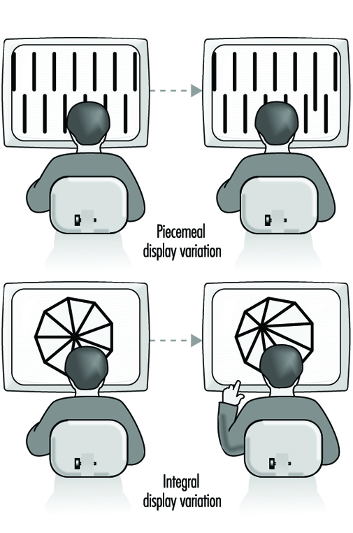 Not all integral displays are equally discriminable. To illustrate the issue, a positive correlation between the two dimensions of a rectangle creates differences in surface, while maintaining an equal shape. Alternatively, a negative correlation creates differences in shape while maintaining an equal surface. The case in which variation of integral dimensions creates a new shape has been referred to as revealing an emergent property of the patterning, which adds to the operator’s ability to discriminate the patterns. Emergent properties depend upon the identity and arrangement of parts but are not identifiable with any single part.
Object and configural displays are not always beneficial. The very fact that they are integral means that the characteristics of the individual variables are harder to perceive. The point is that, by definition, integral dimensions are mutually dependent, thus clouding their individual constituents. There may be circumstances in which this is unacceptable, while one may still wish to profit from the diagnostic patternlike properties, which are typical for the object display. One compromise might be a traditional bar graph display. On the one hand, bar graphs are quite separable. Yet, when positioned in sufficiently close vicinity, the differential lengths of the bars may together constitute an object-like pattern which may well serve a diagnostic aim.
Some diagnostic displays are better than others. Their quality depends on the extent that the display corresponds to the mental model of the task. For example, fault diagnosis on the basis of distortions of a regular polygon, as in figure 1, may still bear little relationship to the domain semantics or to the concept of the operator of the processes in a power plant. Thus, various types of deviations of the polygon do not obviously refer to a specific problem in the plant. Therefore, the design of the most suitable configural display is one that corresponds to the specific mental model of the task. Thus it should be emphasized that the surface of a rectangle is only a useful object display when the product of length and width is the variable of interest!
Interesting object displays stem from three-dimensional representations. For instance, a three-dimensional representation of air traffic—rather than the traditional two-dimensional radar representation—may provide the pilot with a greater “situational awareness” of other traffic. The three-dimensional display has been shown to be much superior to a two-dimensional one since its symbols indicate whether another aircraft is above or below one’s own.
Degraded conditions
Degraded viewing occurs under a variety of conditions. For some purposes, as with camouflage, objects are intentionally degraded so as to prevent their identification. On other occasions, for example in brightness amplification, features may become too blurred to allow one to identify the object. One research issue has concerned the minimal number of “lines” required on a screen or “the amount of detail” needed in order to avoid degradation. Unfortunately, this approach to image quality has not led to unequivocal results. The problem is that identifying degraded stimuli (e.g., a camouflaged armoured vehicle) depends too much on the presence or absence of minor object-specific details. The consequence is that no general prescription about line density can be formulated, except for the trivial statement that degradation decreases as the density increases.
Features of alphanumeric symbols
A major issue in the process of feature extraction concerns the actual number of features which together define a stimulus. Thus, the legibility of ornate characters like Gothic letters is poor because of the many redundant curves. In order to avoid confusion, the difference between letters with very similar features—like the i and the l, and the c and the e—should be accentuated. For the same reason, it is recommended to make the stroke and tail length of ascenders and descenders at least 40% of the total letter height.
It is evident that discrimination among letters is mainly determined by the number of features which they do not share. These mainly consist of straight line and circular segments which may have horizontal, vertical and oblique orientation and which may differ in size, as in lower- and upper-case letters.
It is obvious that, even when alphanumericals are well discriminable, they may easily lose that property in combination with other items. Thus, the digits 4 and 7 share only a few features but they do not do well in the context of larger otherwise identical groups (e.g., 384 versus 387) There is unanimous evidence that reading text in lower case is faster than in capitals. This is usually ascribed to the fact that lower case letters have more distinct features (e.g., dog, cat versus DOG, CAT). The superiority of lower case letters has not only been established for reading text but also for road signs such as those used for indicating towns at the exits of motorways.
Identification
The final perceptual process is concerned with identification and interpretation of percepts. Human limits arising on this level are usually related to discrimination and finding the appropriate interpretation of the percept. The applications of research on visual discrimination are manifold, relating to alphanumerical patterns as well as to more general stimulus identification. The design of brake lights in cars will serve as an example of the last category. Rear-end accidents account for a considerable proportion of traffic accidents, and are due in part to the fact that the traditional location of the brake light next to the rear lights makes it poorly discriminable and therefore extends the driver’s reaction time. As an alternative, a single light has been developed which appears to reduce the accident rate. It is mounted in the centre of the rear window at approximately eye level. In experimental studies on the road, the effect of the central braking light appears to be less when subjects are aware of the aim of the study, suggesting that stimulus identification in the traditional configuration improves when subjects focus on the task. Despite the positive effect of the isolated brake light, its identification might still be further improved by making the brake light more meaningful, giving it the form of an exclamation mark, “!”, or even an icon.
Absolute judgement
Very strict and often counterintuitive performance limits arise in cases of absolute judgement of physical dimensions. Examples occur in connection with colour coding of objects and the use of tones in auditory call systems. The point is that relative judgement is far superior to absolute judgement. The problem with absolute judgement is that the code has to be translated into another category. Thus a specific colour may be linked with an electrical resistance value or a specific tone may be intended for a person for which an ensuing message is meant. In fact, therefore, the problem is not one of perceptual identification but rather of response choice, which will be discussed later in this article. At this point it suffices to remark that one should not use more than four or five colours or pitches so as to avoid errors. When more alternatives are needed one may add extra dimensions, like loudness, duration and components of tones.
Word reading
The relevance of reading separate word units in traditional print is demonstrated by various widely experienced evidence, such as the fact that reading is very much hampered when spaces are omitted, printing errors remain often undetected, and it is very hard to read words in alternating cases (e.g., ALTeRnAtInG). Some investigators have emphasized the role of word shape in reading word units and suggested that spatial frequency analysers may be relevant in identifying word shape. In this view meaning would be derived from total word shape rather than by letter-by-letter analysis. Yet, the contribution of word shape analysis is probably limited to small common words—articles and endings—which is consistent with the finding that printing errors in small words and endings have a relatively low probability of detection.
Text in lower case has an advantage over upper case which is due to a loss of features in the upper case. Yet, the advantage of lower case words is absent or may even be reversed when searching for a single word. It could be that factors of letter size and letter case are confounded in searching: Larger-sized letters are detected more rapidly, which may offset the disadvantage of less distinctive features. Thus, a single word may be about equally legible in upper case as in lower case, while continuous text is read faster in lower case. Detecting a SINGLE capital word amidst many lower case words is very efficient, since it evokes pop-out. An even more efficient fast detection can be achieved by printing a single lower case word in bold, in which case the advantages of pop-out and of more distinctive features are combined.
The role of encoding features in reading is also clear from the impaired legibility of older low-resolution visual display unit screens, which consisted of fairly rough dot matrices and could portray alphanumericals only as straight lines. The common finding was that reading text or searching from a low-resolution monitor was considerably slower than from a paper-printed copy. The problem has largely disappeared with the present-day higher-resolution screens. Besides letter form there are a number of additional differences between reading from paper and reading from a screen. The spacing of the lines, the size of the characters, the type face, the contrast ratio between characters and background, the viewing distance, the amount of flicker and the fact that changing pages on a screen is done by scrolling are some examples. The common finding that reading is slower from computer screens—although comprehension seems about equal—may be due to some combination of these factors. Present-day text processors usually offer a variety of options in font, size, colour, format and style; such choices could give the false impression that personal taste is the major reason.
Icons versus words
In some studies the time taken by a subject in naming a printed word was found to be faster than that for a corresponding icon, while both times were about equally fast in other studies. It has been suggested that words are read faster than icons since they are less ambiguous. Even a fairly simple icon, like a house, may still elicit different responses among subjects, resulting in response conflict and, hence, a decrease in reaction speed. If response conflict is avoided by using really unambiguous icons the difference in response speed is likely to disappear. It is interesting to note that as traffic signs, icons are usually much superior to words, even in the case where the issue of understanding language is not seen as a problem. This paradox may be due to the fact that the legibility of traffic signs is largely a matter of the distance at which a sign can be identified. If properly designed, this distance is larger for symbols than for words, since pictures can provide considerably larger differences in shape and contain less fine details than words. The advantage of pictures, then, arises from the fact that discrimination of letters requires some ten to twelve minutes of arc and that feature detection is the initial prerequisite for discrimination. At the same time it is clear that the superiority of symbols is only guaranteed when (1) they do indeed contain little detail, (2) they are sufficiently distinct in shape and (3) they are unambiguous.
Capabilities and Limits for Decision
Once a precept has been identified and interpreted it may call for an action. In this context the discussion will be limited to deterministic stimulus-response relations, or, in other words, to conditions in which each stimulus has its own fixed response. In that case the major problems for equipment design arise from issues of compatibility, that is, the extent to which the identified stimulus and its related response have a “natural” or well-practised relationship. There are conditions in which an optimal relation is intentionally aborted, as in the case of abbreviations. Usually a contraction like abrvtin is much worse than a truncation like abbrev. Theoretically, this is due to the increasing redundancy of successive letters in a word, which allows “filling out” final letters on the basis of earlier ones; a truncated word can profit from this principle while a contracted one cannot.
Mental models and compatibility
In most compatibility problems there are stereotypical responses derived from generalized mental models. Choosing the null position in a circular display is a case in point. The 12 o’clock and 9 o’clock positions appear to be corrected faster than the 6 o’clock and 3 o’clock positions. The reason may be that a clockwise deviation and a movement in the upper part in the display are experienced as “increases” requiring a response that reduces the value. In the 3 and 6 o’clock positions both principles conflict and they may therefore be handled less efficiently. A similar stereotype is found in locking or opening the rear door of a car. Most people act on the stereotype that locking requires a clockwise movement. If the lock is designed in the opposite way, continuous errors and frustration in trying to lock the door are the most likely result.
With respect to control movements the well-known Warrick’s principle on compatibility describes the relation between the location of a control knob and the direction of the movement on a display. If the control knob is located to the right of the display, a clockwise movement is supposed to move the scale marker up. Or consider moving window displays. According to most people’s mental model, the upward direction of a moving display suggests that the values go up in the same way in which a rising temperature in a thermometer is indicated by a higher mercury column. There are problems in implementing this principle with a “fixed pointer-moving scale” indicator. When the scale in such an indicator moves down, its value is intended to increasing. Thus a conflict with the common stereotype occurs. If the values are inverted, the low values are on the top of the scale, which is also contrary to most stereotypes.
The term proximity compatibility refers to the correspondence of symbolic representations to people’s mental models of functional or even spatial relationships within a system. Issues of proximity compatibility are more pressing as the mental model of a situation is more primitive, global or distorted. Thus, a flow diagram of a complex automated industrial process is often displayed on the basis of a technical model which may not correspond at all with the mental model of the process. In particular, when the mental model of a process is incomplete or distorted, a technical representation of the progress adds little to develop or correct it. A daily-life example of poor proximity compatibility is an architectural map of a building that is intended for viewer orientation or for showing fire escape routes. These maps are usually entirely inadequate—full of irrelevant details—in particular for people who have only a global mental model of the building. Such convergence between map reading and orientation comes close to what has been called “situational awareness”, which is particularly relevant in three-dimensional space during an air flight. There have been interesting recent developments in three-dimensional object displays, representing attempts to achieve optimal proximity compatibility in this domain.
Stimulus-response compatibility
An example of stimulus-response (S-R) compatibility is typically found in the case of most text processing programs, which assume that operators know how commands correspond to specific key combinations. The problem is that a command and its corresponding key combination usually fail to have any pre-existing relation, which means that the S-R relations must be learned by a painstaking process of paired-associate learning. The result is that, even after the skill has been acquired, the task remains error-prone. The internal model of the program remains incomplete since less practised operations are liable to be forgotten, so that the operator can simply not come up with the appropriate response. Also, the text produced on the screen usually does not correspond in all respects to what finally appears on the printed page, which is another example of inferior proximity compatibility. Only a few programs utilize a stereotypical spatial internal model in connection with stimulus-response relations for controlling commands.
It has been correctly argued that there are much better pre-existing relations between spatial stimuli and manual responses—like the relation between a pointing response and a spatial location, or like that between verbal stimuli and vocal responses. There is ample evidence that spatial and verbal representations are relatively separate cognitive categories with little mutual interference but also with little mutual correspondence. Hence, a spatial task, like formatting a text, is most easily performed by spatial mouse-type movement, thus leaving the keyboard for verbal commands.
This does not mean that the keyboard is ideal for carrying out verbal commands. Typing remains a matter of manually operating arbitrary spatial locations which are basically incompatible with processing letters. It is actually another example of a highly incompatible task which is only mastered by extensive practise, and the skill is easily lost without continuous practice. A similar argument can be made for shorthand writing, which also consists of connecting arbitrary written symbols to verbal stimuli. An interesting example of an alternative method of keyboard operation is a chording keyboard.
The operator handles two keyboards (one for the left and one for the right hand) both consisting of six keys. Each letter of the alphabet corresponds to a chording response, that is, a combination of keys. The results of studies on such a keyboard showed striking savings in the time needed for acquiring typing skills. Motor limitations limited the maximal speed of the chording technique but, still, once learned, operator performance approached the speed of the conventional technique quite closely.
A classical example of a spatial compatibility effect concerns the traditional arrangements of stove burner controls: four burners in a 2 ´ 2 matrix, with the controls in a horizontal row. In this configuration, the relations between burner and control are not obvious and are poorly learned. However, despite many errors, the problem of lighting the stove, given time, can usually be solved. The situation is worse when one is faced with undefined display-control relations. Other examples of poor S-R compatibility are found in the display-control relations of video cameras, video recorders and television sets. The effect is that many options are never used or must be studied anew at each new trial. The claim that “it is all explained in the manual”, while true, is not useful since, in practice, most manuals are incomprehensible to the average user, in particular when they attempt to describe actions using incompatible verbal terms.
Stimulus-stimulus (S-S) and response-response (R-R) compatibility
Originally S-S and R-R compatibility were distinguished from S-R compatibility. A classical illustration of S-S compatibility concerns attempts in the late forties to support auditory sonar by a visual display in an effort to enhance signal detection. One solution was sought in a horizontal light beam with vertical perturbations travelling from left to right and reflecting a visual translation of the auditory background noise and potential signal. A signal consisted of a slightly larger vertical perturbation. The experiments showed that a combination of the auditory and visual displays did not do better than the single auditory display. The reason was sought in a poor S-S compatibility: the auditory signal is perceived as a loudness change; hence visual support should correspond most when provided in the form of a brightness change, since that is the compatible visual analogue of a loudness change.
It is of interest that the degree of S-S compatibility corresponds directly to how skilled subjects are in cross-modality matching. In a cross-modality match, subjects may be asked to indicate which auditory loudness corresponds to a certain brightness or to a certain weight; this approach has been popular in research on scaling sensory dimensions, since it allows one to avoid mapping sensory stimuli to numerals. R-R compatibility refers to correspondence of simultaneous and also of successive movements. Some movements are more easily coordinated than others, which provides clear constraints for the way a succession of actions—for example, successive operation of controls—is most efficiently done.
The above examples show clearly how compatibility issues pervade all user-machine interfaces. The problem is that the effects of poor compatibility are often softened by extended practice and so may remain unnoticed or underestimated. Yet, even when incompatible display-control relations are well-practised and do not seem to affect performance, there remains the point of a larger error probability. The incorrect compatible response remains a competitor for the correct incompatible one and is likely to come through on occasion, with the obvious risk of an accident. In addition, the amount of practice required for mastering incompatible S-R relations is formidable and a waste of time.
Limits of Motor Programming and Execution
One limit in motor programming was already briefly touched upon in the remarks on R-R compatibility. The human operator has clear problems in carrying out incongruent movement sequences, and in particular, changing from the one to another incongruent sequence is hard to accomplish. The results of studies on motor coordination are relevant to the design of controls in which both hands are active. Yet, practice can overcome much in this regard, as is clear from the surprising levels of acrobatic skills.
Many common principles in the design of controls derive from motor programming. They include the incorporation of resistance in a control and the provision of feedback indicating that it has been properly operated. A preparatory motor state is a highly relevant determinant of reaction time. Reacting to an unexpected sudden stimulus may take an additional second or so, which is considerable when a fast reaction is needed—as in reacting to a lead car’s brake light. Unprepared reactions are probably a main cause of chain collisions. Early warning signals are beneficial in preventing such collisions. A major application of research on movement execution concerns Fitt’s law, which relates movement, distance and the size of the target that is aimed at. This law appears to be quite general, applying equally to an operating lever, a joystick, a mouse or a light pen. Among others, it has been applied to estimate the time needed to make corrections on computer screens.
There is obviously much more to say than the above sketchy remarks. For instance, the discussion has been almost fully limited to issues of information flow on the level of a simple choice reaction. Issues beyond choice reactions have not been touched upon, nor problems of feedback and feed forward in the ongoing monitoring of information and motor activity. Many of the issues mentioned bear a strong relation to problems of memory and of planning of behaviour, which have not been addressed either. More extensive discussions are found in Wickens (1992), for example.
" DISCLAIMER: The ILO does not take responsibility for content presented on this web portal that is presented in any language other than English, which is the language used for the initial production and peer-review of original content. Certain statistics have not been updated since the production of the 4th edition of the Encyclopaedia (1998)."